Tagged: film
Confused about Robots
I am confused.com about some elements of the new Confused.com advertising strategy.
I have posted before about how I did not especially like Cara the character, so I was keen to see what would replace it. The first ad I saw had a degree of charm … old ladies at the car boot sale.
You can question the choice of old ladies … is that a Confused.com target market? and I a little disturbed that the insight is a rubbish robot. I get the desire to make it like “short-circuit”, but the dropping of things and random buys don’t instil trust or confidence. It’s early days though and the campaign is brilliantly integrated. There is even a website for Brian. Clearly they are going for charm of an older style robot, but I don’t know how well-remembered Short Circuit is as a film. And, as you will see later, I think they let themselves down on the charm front rather badly in the end.
The clear intention is to mimic the success of Meerkats.
The second ad reassured me more about charm, it is quite funny ! the motorway bridge location is perfectly used to make the point about saving money for lots of different cars and people. The end line is genuinely funny so I won’t spoil it by telling you what it is !
But then, and I accept this is subjective, it goes horribly off kilter. The meerkats have charm, and family at their heart. Churchill the Dog would not bite you or be anything other than friendly, he’s innocent. So what are Confused doing in this ad. The clear implication of lovers lane is dodgy at best especially when combined with the end line and the movement of the woman at the start: (the ads are all linked on YouTube … so all 7 appear here in one loop. I notice there is a pre watershead version that is less offensive as well).
This ad could undo some great integrated marketing that is clearly engaging on one level already, and which is the clear intention of the suite of marketing.
Having recently posted about Insurance advertising from Aviva, Hastings, Co-op, Admiral. I fear this will not ‘trouble the scorers’ as they say. Competition in the Aggregator market is important for consumers, but, unless this engages at a family level I fear this will not challenge the mighty Meerkats
9/10 for integration and use of social media and the motorway ad … but dropping to 5/10 for the lovers lane execution. Confused.com have invested heavily in this character, they have to make it work one senses!
The Ad Critic
July 10th ’13
I am indebted to Carl Sharples for assisting with this post
Ikea 1 Gnomes 0
My Dad had a pal who enjoyed knocking the heads of Gnomes. I see nothing wrong with that … I dislike the kitsch little things myself.
So it was inevitable that I would love the new Ikea ad .. The full ad is a 2 minute 6 second epic … think Small Soldiers or The Magnificent Seven – a small plucky band (a Mum and Dad in this case) at war with Gnomes in their garden !
It is fun, and typically British and typically Ikea at the same time. The female lead is especially well cast and in fact the actors make the ad ‘ believable’ or at least as much as is required. The trick is not to animate the Gnomes – the facial expressions are fixed. But like the Weeping Angels in Doctor Who, the power is in the ‘stop frame’ animation. CGI would make this a much less engaging ad.
It promotes Ikea’s new outdoor range and is called ‘Time for Change’. It has a great driving soundtrack, and it looks like a bespoke composition – you can download it on iTunes and its called Time For Change by Tom Player Feat. The Heritage Voices and Budapest Film Orchestra. It makes the ad .. It, like a good soundtrack should, makes the cinematography really come to life.
I like the implication that Gnomes are organised, I like the slow-mo hose pipe scene and the Gnome humping the lady’s leg – and the end cliffhanger is good enough for any soap opera on TV.
The ad is just great summer fun – gets the message across well and engages in a way that fits the brand.
Finally – it is well integrated to Facebook, timing is everything and with a sunny Bank Holiday Monday, posts have increased on their timeline. Product placement is excellent – but given the experience of the brand in advertising creativity that is no surprise to me.
A great Advert 8/10 and a great campaign 8.5/10
The Ad Critic
7th May ’13
Trance : film poster and on-line banners
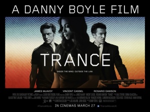
Driving to work recently I saw a spectacularly good 48 sheet poster for a new Danny Boyle film called Trance. Very Hitchockesque it looked.
It had real standout from the clutter of car and ‘100% british beef/lamb/pork’ surpermarket ads littering my drive to work.
It showed the stars in quite a traditional heroic line up looking intense and away from camera, but the background really gave the poster some punch. You will know from my previous posts that I have a strong belief that Outdoor work should minimise copy – this is a great example in 5 words you probably have enough to make your mind up if you want to investigate further or not, but it’s the background that makes you read the copy I think.
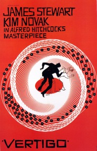
Being different works for this film and the tightly cropped circles somehow are redolent of hypnosis and modern culture both at the same time. The film bills itself as ‘reality blurring’ and this creative device with it’s ‘Op Art’ references certainly points to that and there is a clear homage to Vertigo as well;
But, more importantly, did it do it’s job? Did it make me go and see the movie?
Well, not quite, but I should probably say, not yet.
It did make me look at the trailer and it does look an interesting film.
Nice to see that the posters have been considered in the isolation of the media channel too. The trailer does not see a need to replicate or even reference the outdoor poster executions.
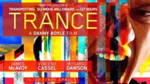
The on-line banner advertising is interesting too. It has a completely different creative, but a similar use of an Op Art reference and again it has standout – this time by image and color as well as style. Nice work and for some reason the colour palette reminded me of the artwork for Slumdog Millionaire, another Danny Boyle film, coincidence? Probably not you have to think. Nice work 7/10 I think.
The Ad Critic
26th April ’13
Copyright for Trance advertising: Danny Boyle/Fox Spotlight


